leeheewon
Works on the various types of graphics, Such as Visual graphic, Editorial design, Typography, Branding and more.
A collaborative design studio engaged in ongoing partnerships with Artists, Curators, Editors, Architects, Designers and Institutions. Based in Seoul, Korea.
2025
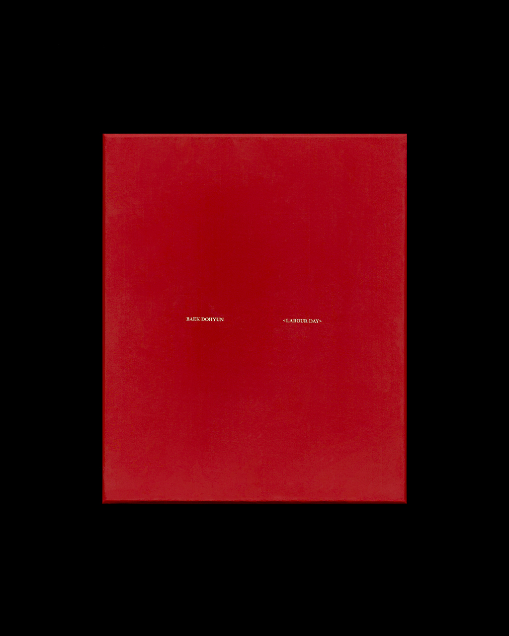
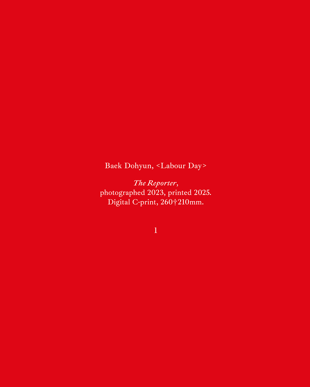
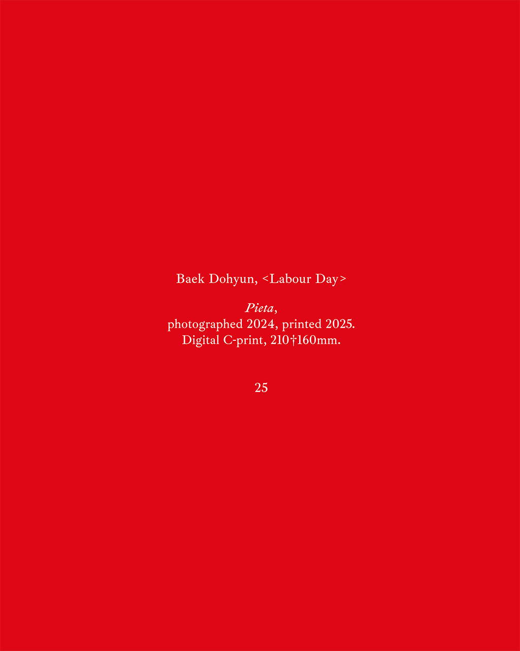
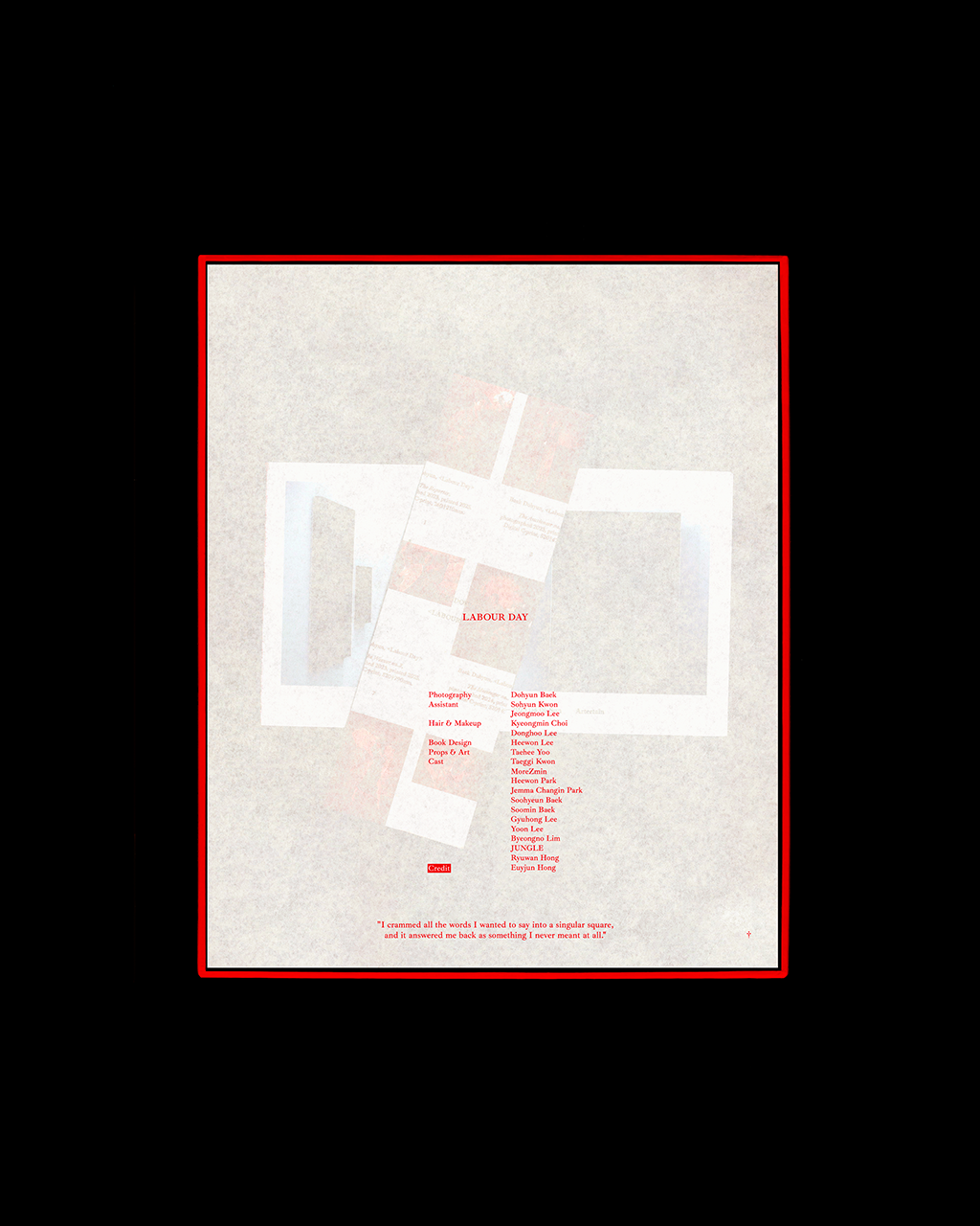
BAEK DOHYUN Labour day Book Design
book
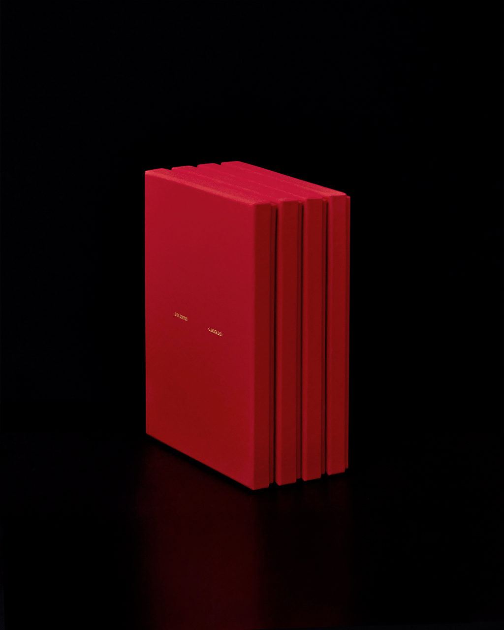
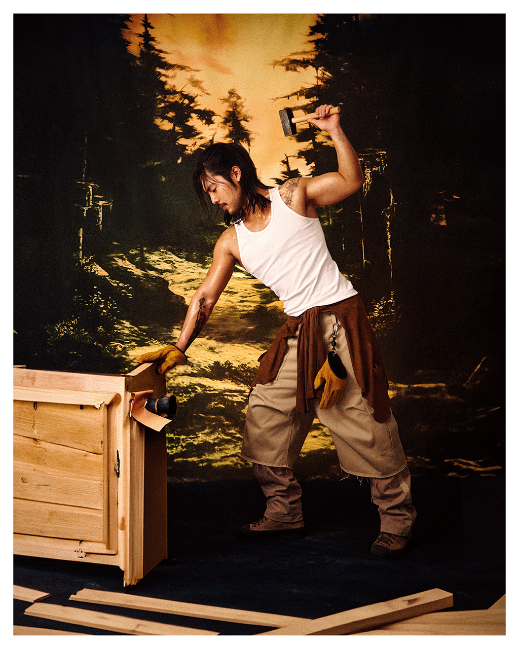
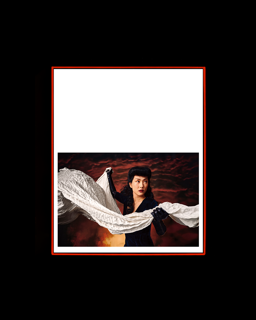
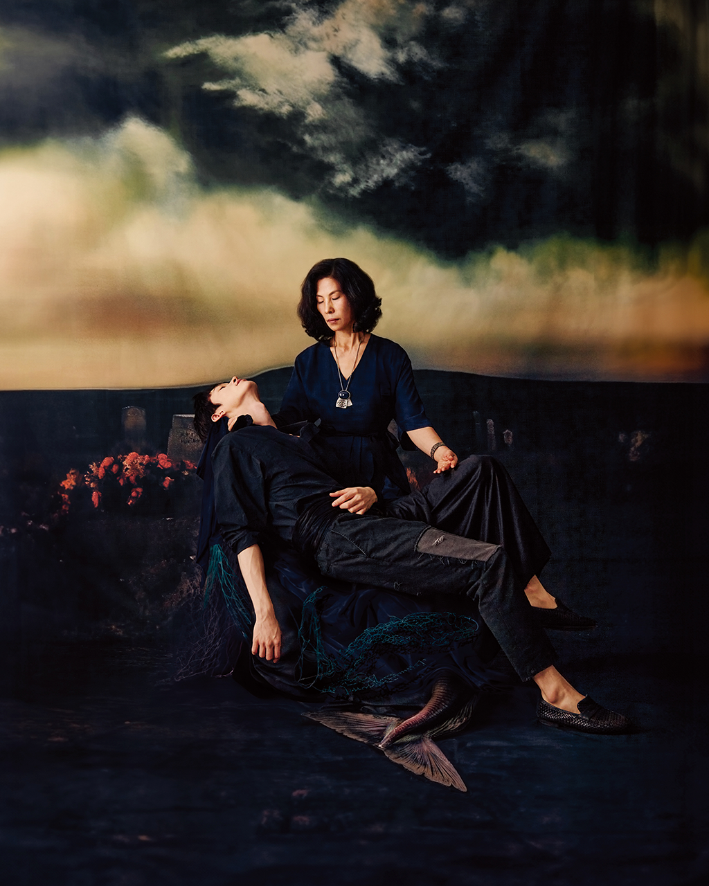
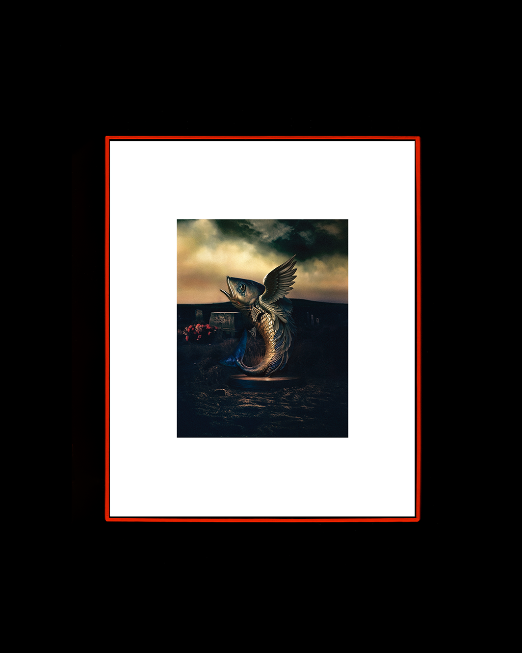
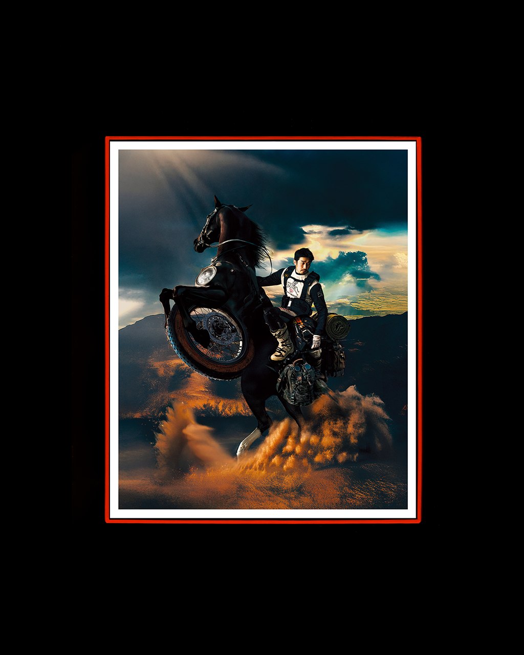
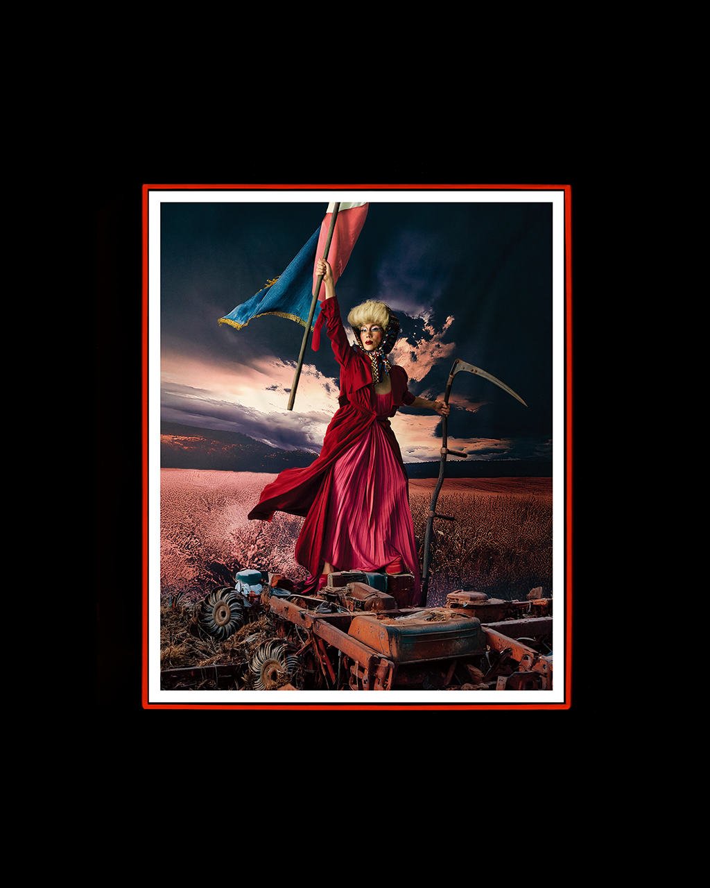
Designed the exhibition catalog Labour Day by artist Do Hyun Baek.
The publication features a total of 57 works, including those exhibited in March 2025 and several previously unreleased pieces.
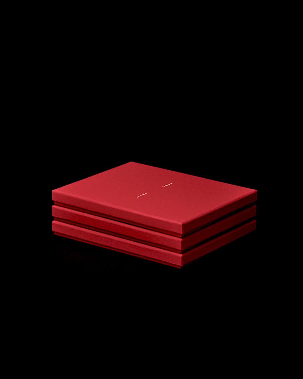
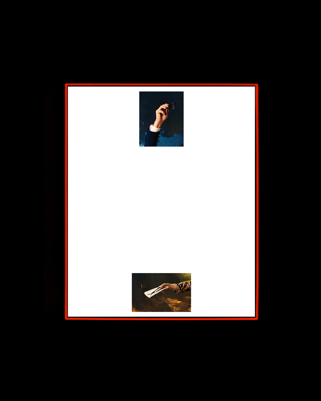
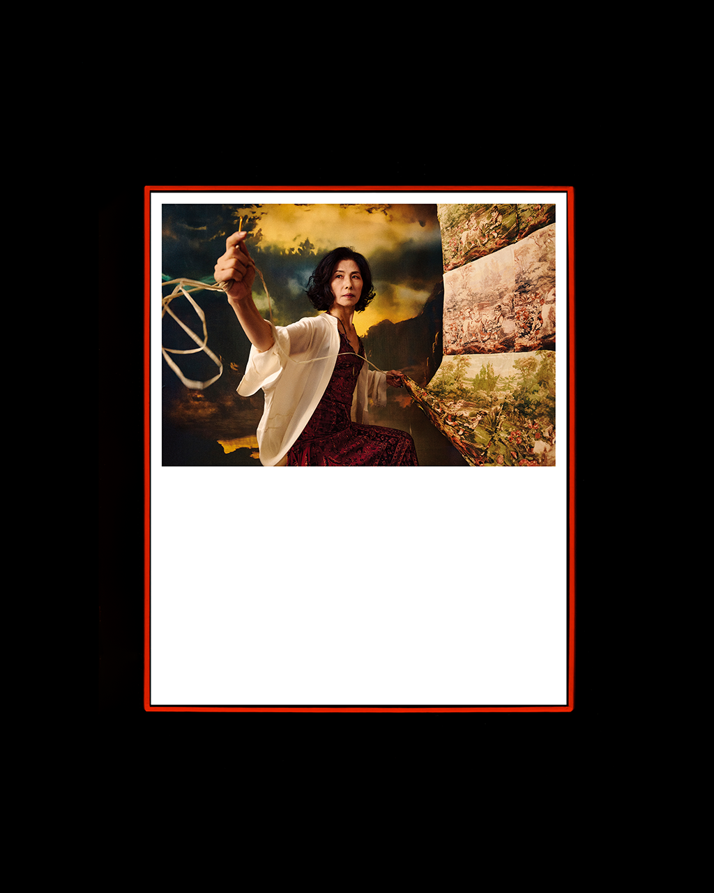
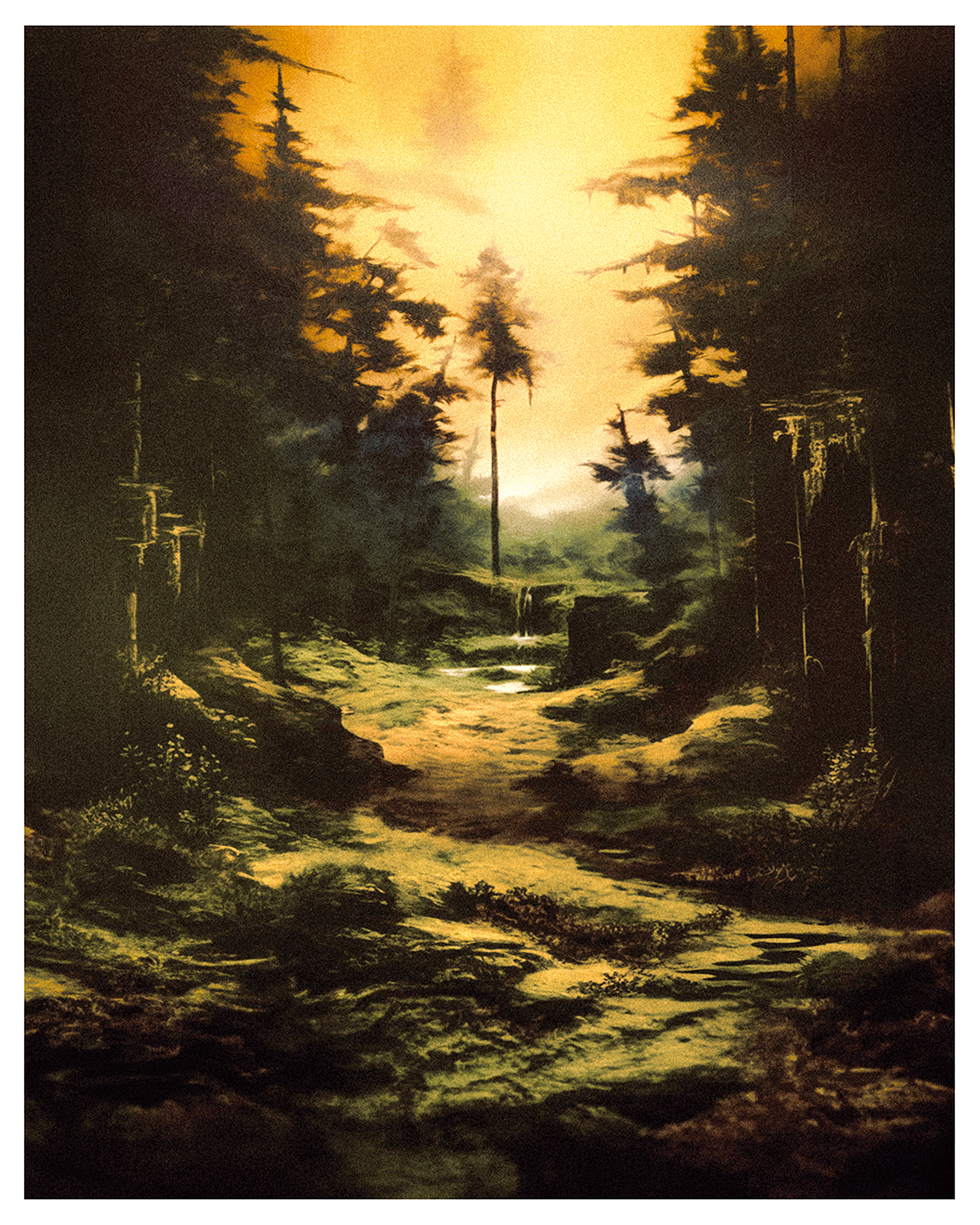
Starting from the concept of “re-binding exhibited works,” the catalog was designed without traditional binding.
Each piece was printed as an individual sheet and housed within a single box, allowing the collection to function as a book when enclosed, and as individual artworks when the sheets are taken out—designed to even be framed as part of an extended exhibition.
Under this unbound format, papers of varying weights and textures were freely combined.
The box was wrapped in a specially coated paper, allowing subtle tactile variations to be felt through the hand.
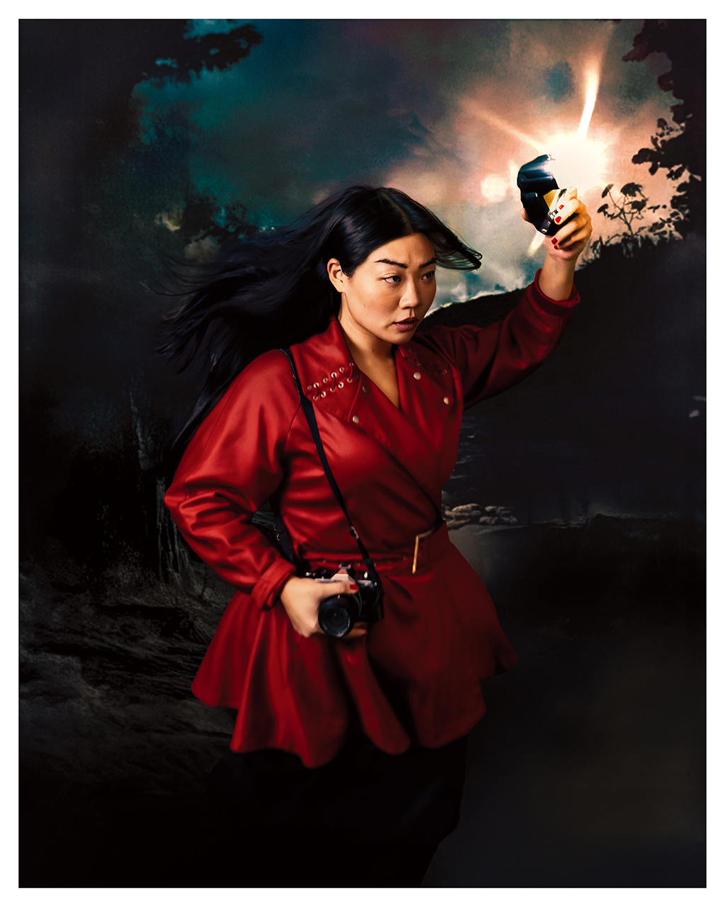
A red hue—found at the intersection of complementary and analogous colors drawn from the artworks—was chosen to accentuate the intensity of the portrait pieces.
The act of unboxing itself was treated as a design element.
The lower box was made slightly taller than the upper, giving the impression of precious works stored deep inside, while ensuring a smooth and natural opening experience.
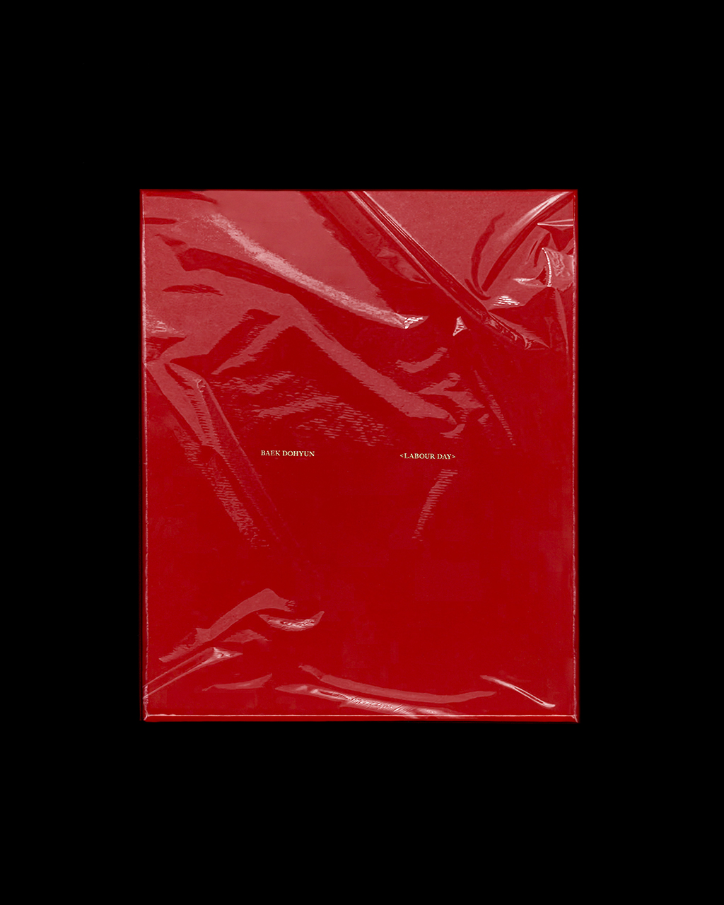
The catalog was produced as a limited edition of 100, finished with vinyl wrapping, and all copies were sold out by May 2025.
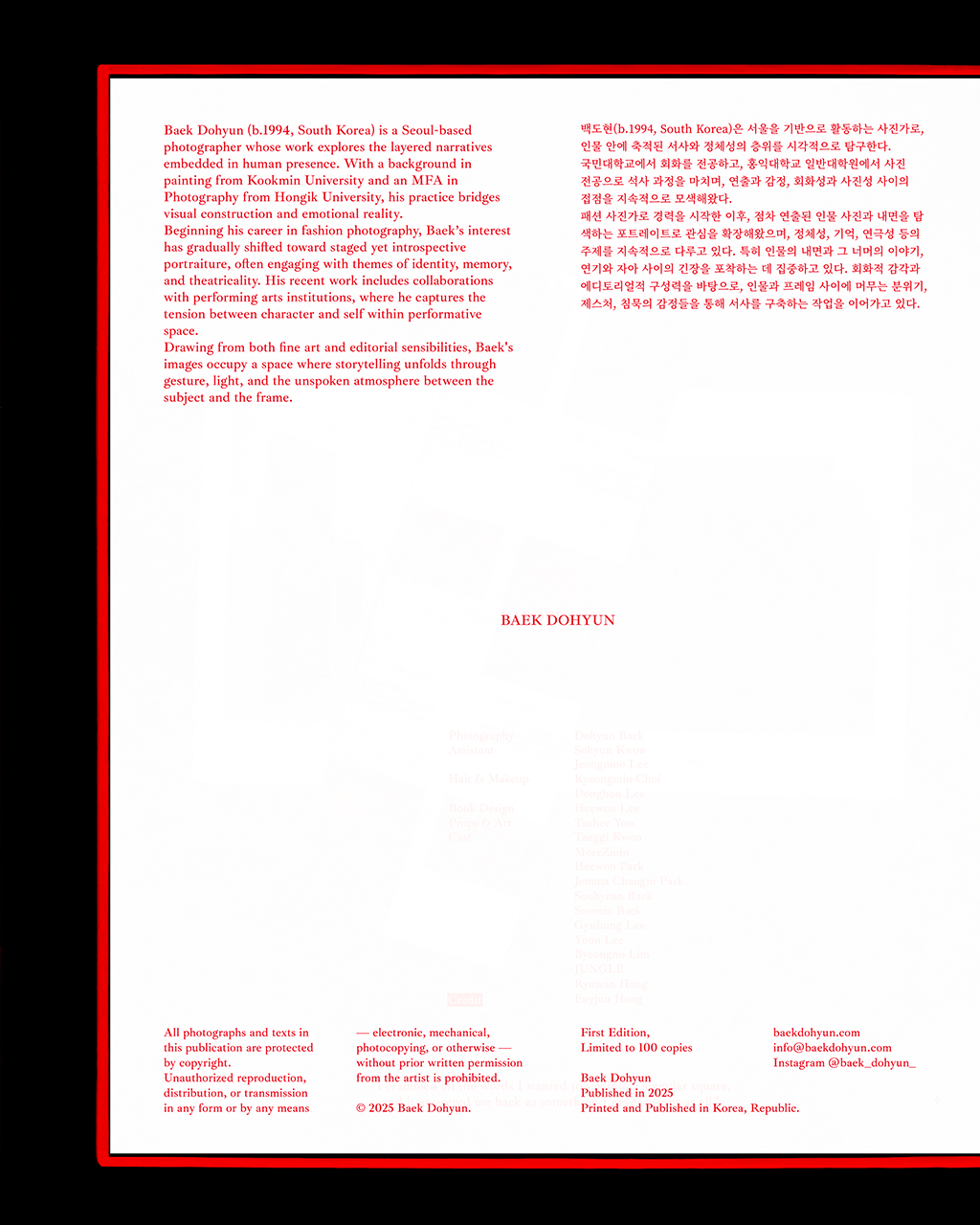
Client: BAEK DOHYUN
Artworks and Product shot by: BAEK DOHYUN
Design: HEEWON LEE
Production Management: HEEWON LEE
Project Period: March - May 2025
Printed photo collection box
Limited to 100 copies
250 x 210 x 23 mm
작가 백도현의 《Labour Day》 도록 디자인을 진행했습니다. 이번 도록은 2025년 3월 전시된 작품들과 미전시작을 포함한 총 57점의 작품을 담고 있습니다.
‘전시된 작품을 다시 엮는다’는 개념에서 출발하여, 제본 방식을 배제하고 각 작품을 낱장으로 구성해 하나의 상자에 담는 형태를 선택했습니다. 이 구조는 작품들이 상자 안에 있을 때는 ‘책’으로서의 성격을, 상자 밖에서는 ‘하나의 작품’으로서의 성격을 동시에 지닐 수 있도록 했습니다. 때로는 액자에 담겨 또 다른 전시로 확장될 수 있도록 설계했습니다.
제본을 하지 않는 방향 아래, 다양한 무게와 질감의 종이를 조합해 자유롭게 구성했습니다. 상자는 특별한 코팅이 입힌 종이로 감싸, 손끝에 닿는 감각 속에서도 질감의 변화를 느낄 수 있도록 했습니다.
상자의 컬러로는 작품들의 주요 컬러에서 보색과 유사색의 교차점에 위치한 ‘붉은색’을 선택해, 강렬한 인물 사진의 톤을 한층 돋보이게 했습니다.
또한 ‘꺼내는 경험’ 자체를 하나의 디자인 요소로 보고, 아랫상자의 높이를 윗상자보다 더 길게 설정하여 깊은 곳에 소중한 작품이 담겨 있다는 인상을 주면서도 상자를 여는 행위가 자연스럽고 용이하도록 했습니다.
도록은 비닐 랩핑으로 마감해 100부 한정 수량으로 제작되었으며, 2025년 5월 전량 판매 완료되었습니다.
アーティスト ペク・ドヒョン氏の図録《Labour Day》のデザインを手がけました。
本図録は、2025年3月に展示された作品および未発表作品を含む、全57点を収録しています。
「展示された作品を再び編み直す」というコンセプトから出発し、従来の製本を行わず、各作品を一枚ずつのシートとして構成し、ひとつの箱に収める形式を採用しました。
この構造は、作品が箱の中にあるときは〈書物〉として、取り出されたときには〈ひとつの作品〉として機能し、額装することで展示へと拡張できるよう設計されています。
非製本という形式のもと、重さや質感の異なる用紙を自由に組み合わせました。
箱は特別なコーティングを施した紙で包み、手に触れた際にも繊細な質感の変化を感じられるようにしています。
作品群における補色と類似色の交差点から「赤」を選び、ポートレート作品の力強いトーンをより際立たせました。
また、「取り出す」という行為そのものをデザイン要素として捉え、下箱の高さを上箱よりも長く設計しました。
これにより、作品が奥深く大切に保管されている印象を与えると同時に、開閉の動作を自然で滑らかに行えるようにしています。
図録はビニールラッピング仕上げで100部限定制作され、2025年5月に完売となりました。
Work Experience
2022-2026
Graphic Designer
own studio
2020-2022
Object & Graphic Part | Graphic Team Leader
Brand Gentle Monster
2017-2022
Graphic Designer
Brand Gentle Monster
2016-2017
Graphic Designer
Studio Swyp
2015
Graphic Designer Intern
Studio Sparks Edition
Education
2013-2016
Communication Design
SADI (Samsung Art & Design Institute)
Contact
email
info@o-w-n.kr
instagram
@sfzheewon