leeheewon
Works on the various types of graphics, Such as Visual graphic, Editorial design, Typography, Branding and more.
A collaborative design studio engaged in ongoing partnerships with Artists, Curators, Editors, Architects, Designers and Institutions. Based in Seoul, Korea.
2025
LOAB Hannam Branding, Signage Graphic
branding
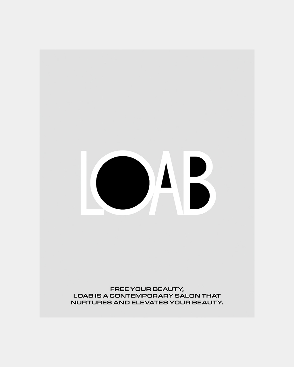
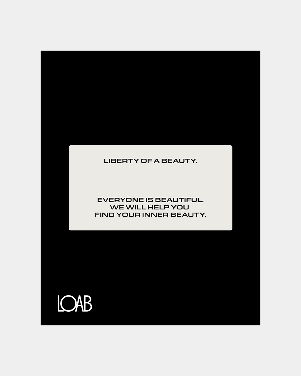
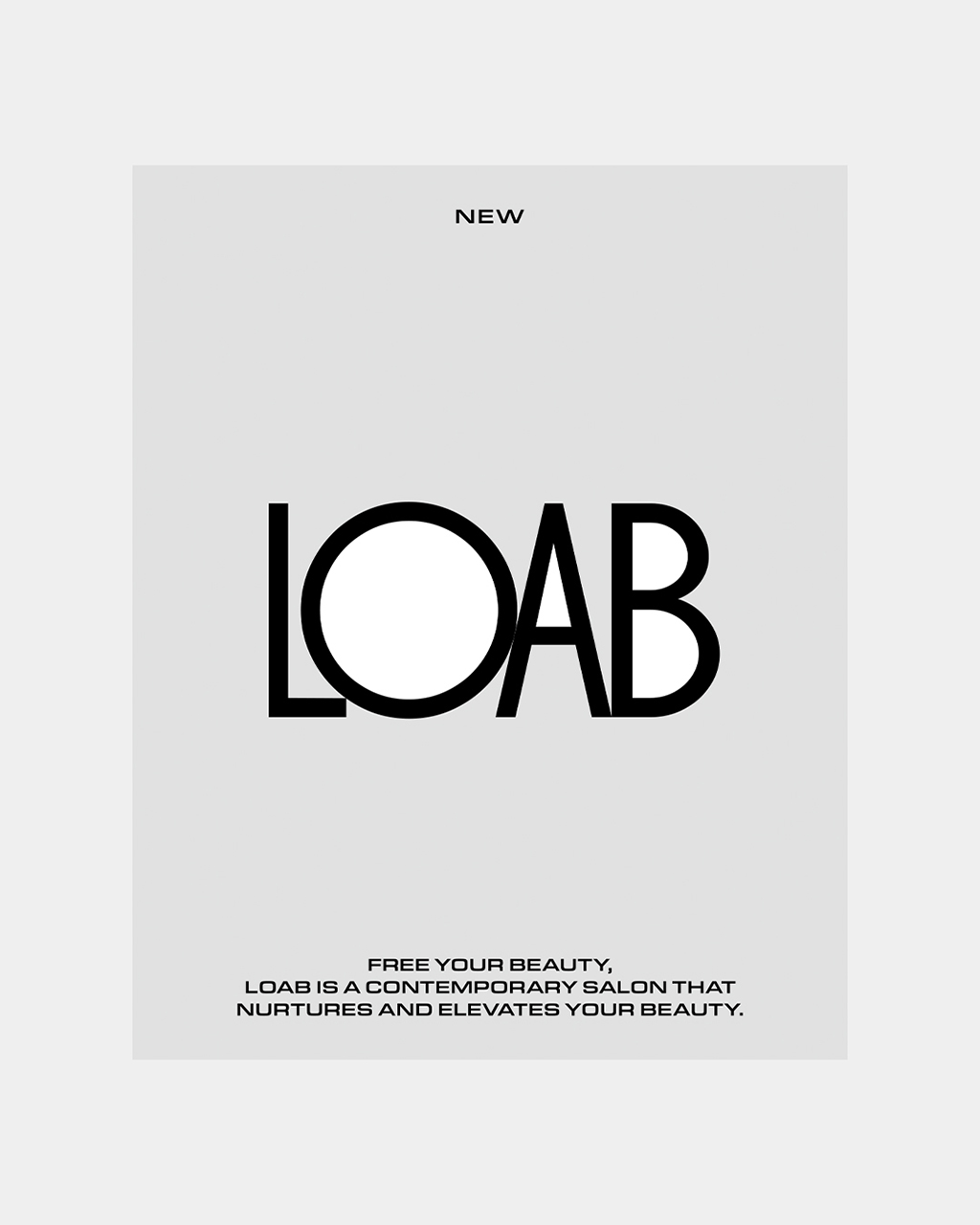
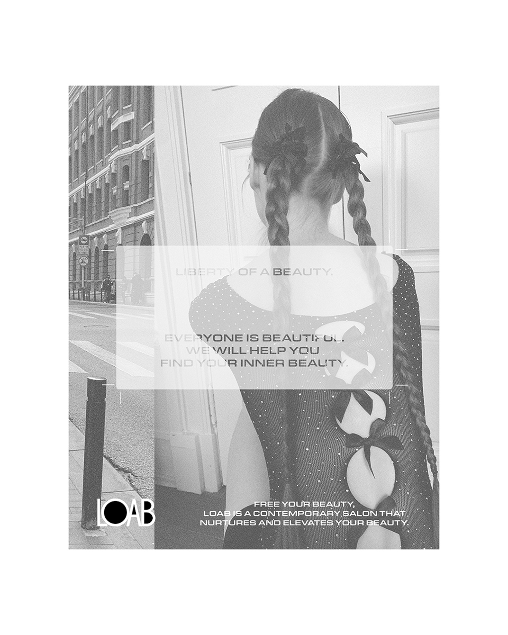
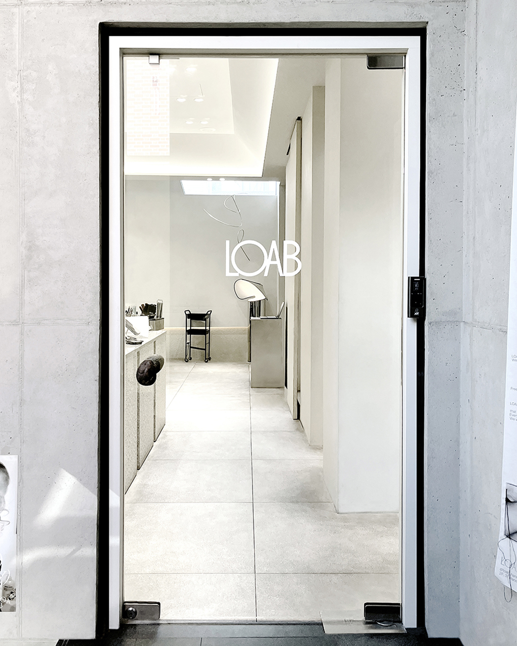
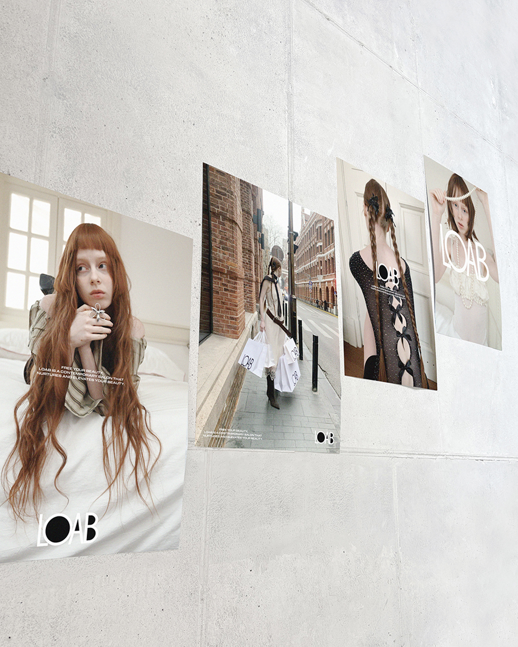
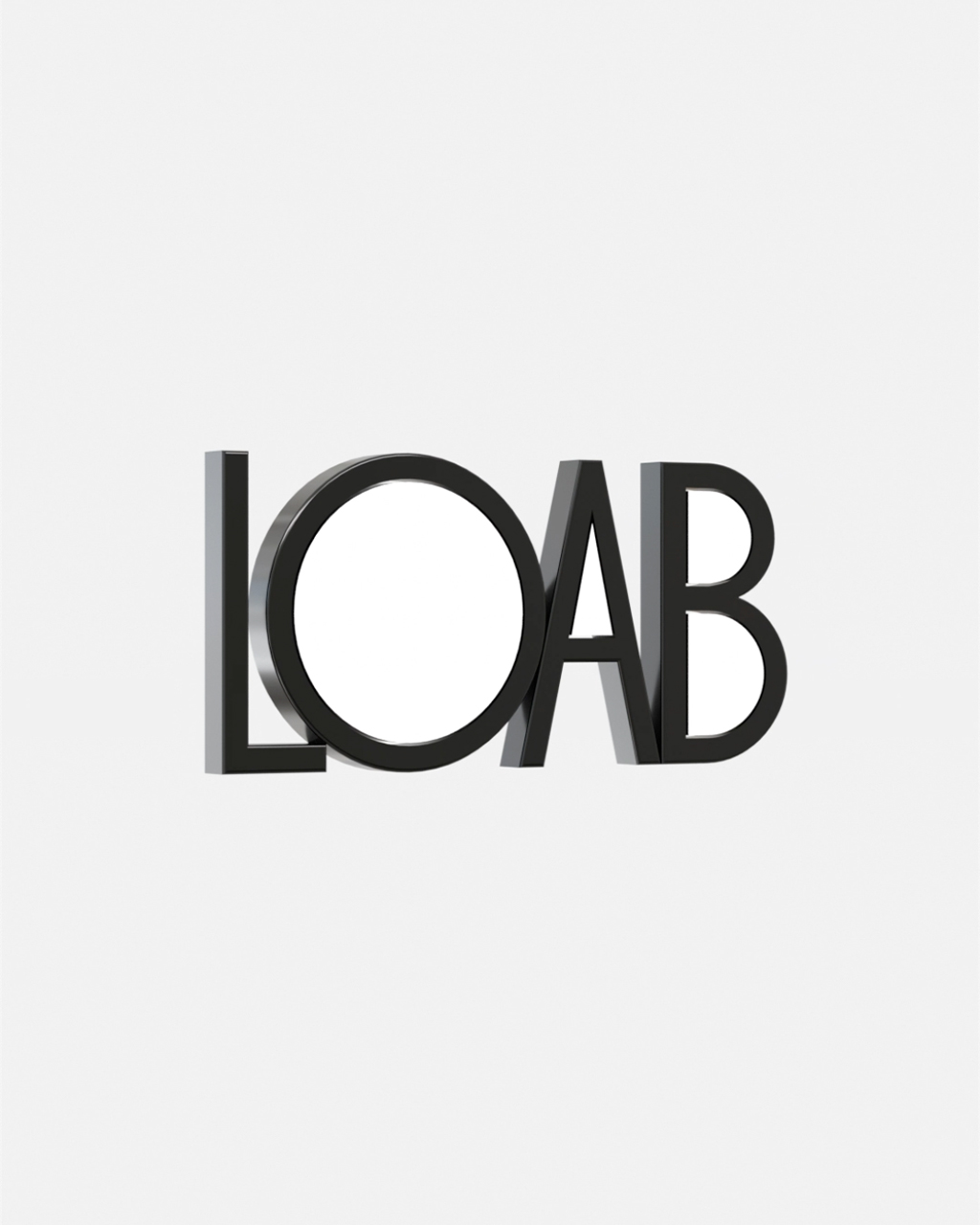
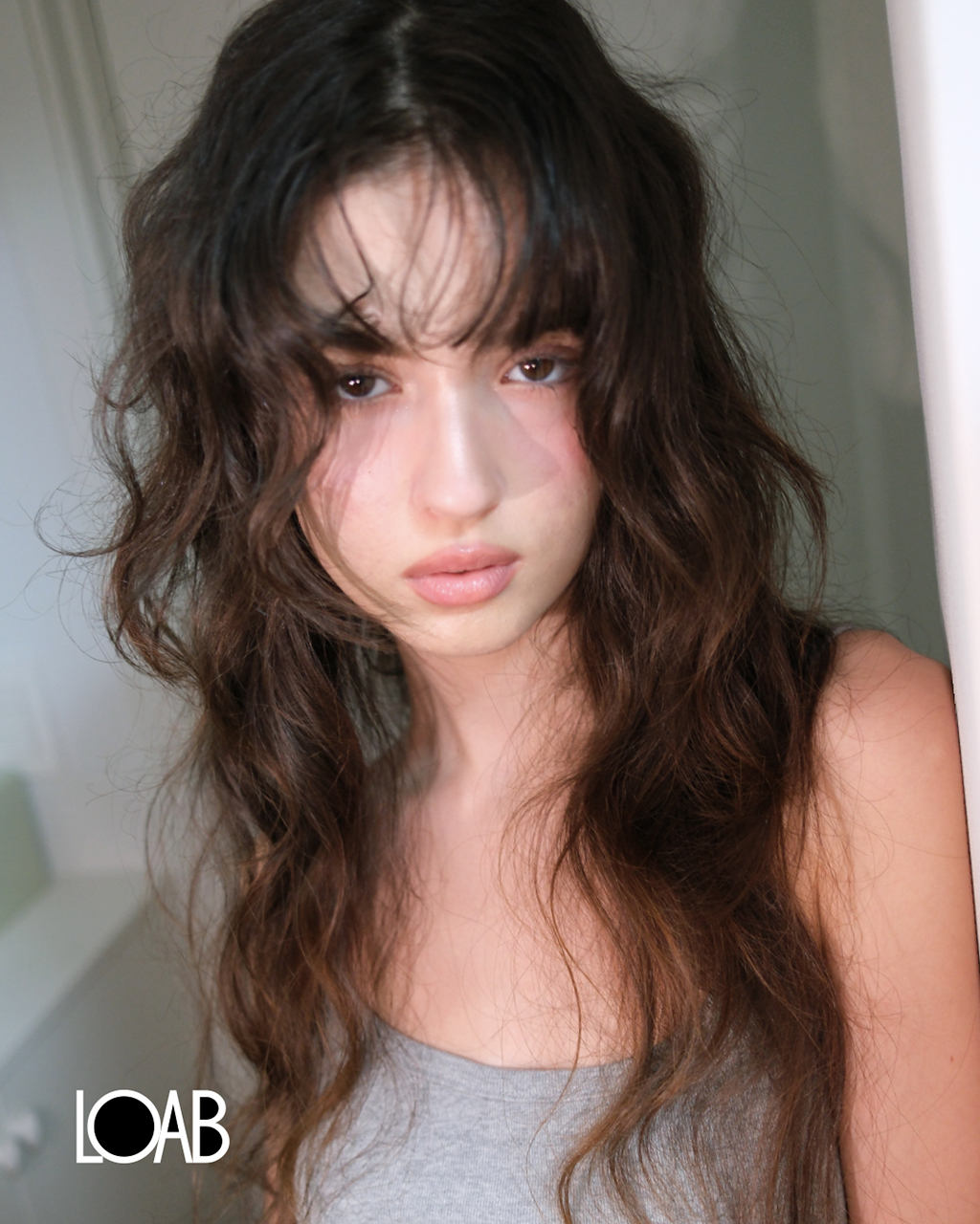
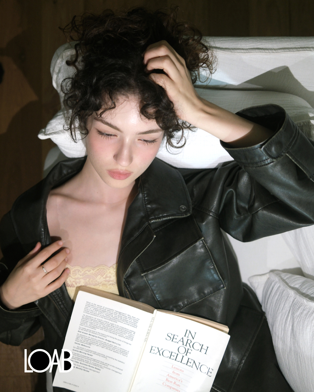
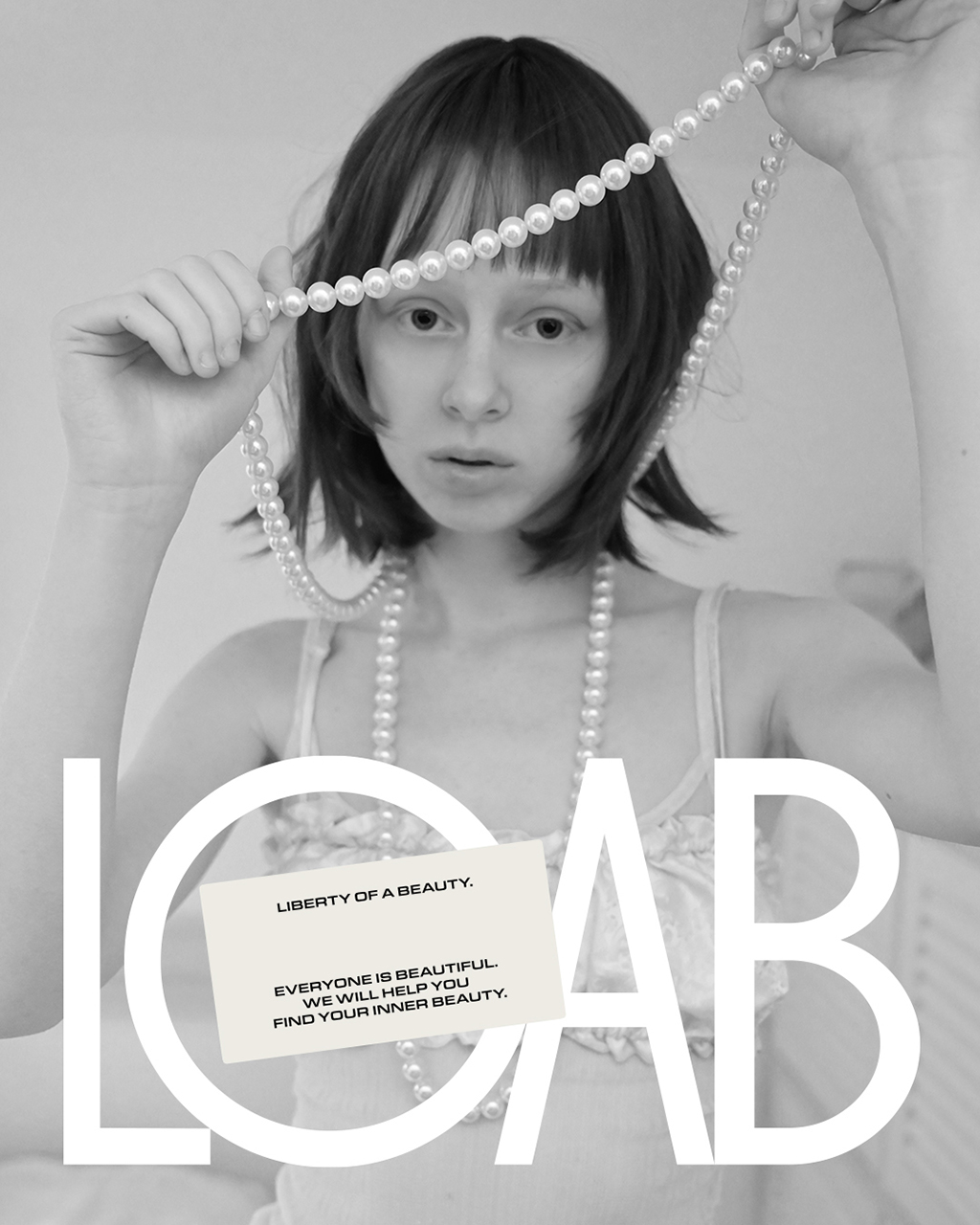
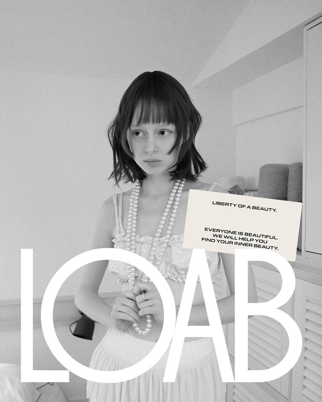
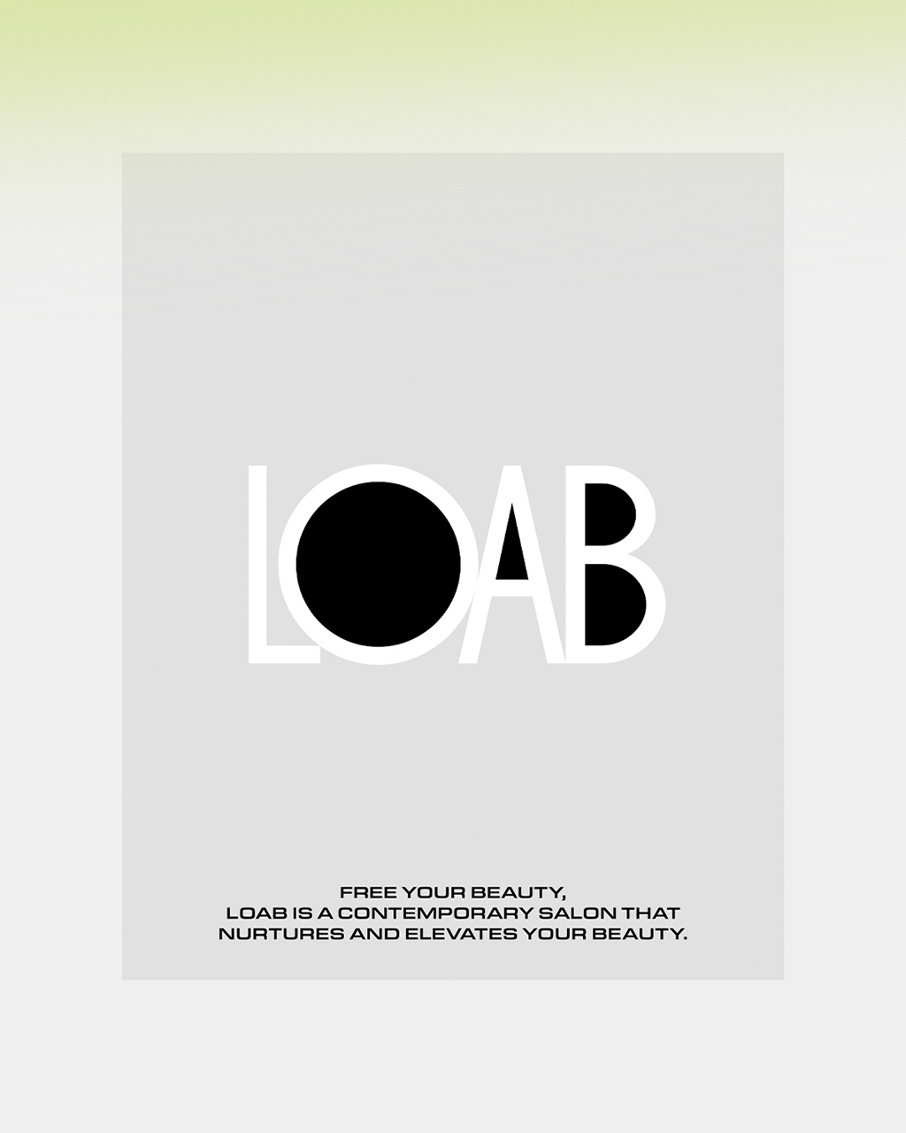
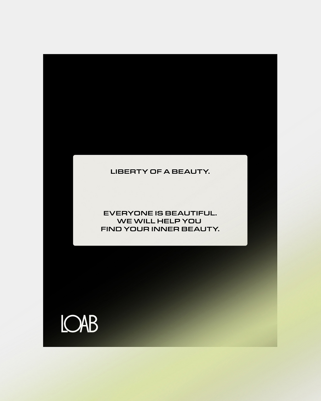
Led the branding design for LOAB, a hair salon located in Hannam-dong, Seoul. To move beyond the conventional graphic moods commonly found in domestic salons, we aimed to establish a refined and distinctive identity for LOAB. The new logotype strikes a balance between classic and modern aesthetics, with each letterform rendered in black and white—visually embodying LOAB’s philosophy of embracing both inner and outer beauty.
A neutral sans-serif typeface was selected for the body text, offering greater versatility than the geometric sans used in the logo—while still preserving brand consistency.
The core color palette centers on black, white, and grayscale, with seasonal extensions planned to enhance LOAB’s visual identity through a dynamic and evolving system.
Image Credit: LOAB
서울 한남동에 위치한 헤어샵 LOAB의 브랜딩 디자인을 진행했습니다. 기존의 국내 헤어샵들이 가지고 있는 그래픽 무드에서 벗어나, LOAB만의 차별화된 아이덴티티를 구축하고자 했습니다. 클래식과 모던함이 조화롭게 어우러진 새로운 로고타입은, 글자의 모든 공간을 블랙과 화이트로 채워 LOAB가 전하고자 하는 ‘내면과 외면의 아름다움’이라는 메시지를 시각적으로 담아냈습니다.
본문용 서체는 로고의 베이스가 된 지오메트릭 산스 계열이 아닌, 중립적이고 확장 가능한 톤의 산세리프 서체를 사용하여 전체적인 브랜드 무드에 유연함을 더했습니다.
컬러는 블랙, 화이트 그리고 그레이스케일을 중심으로 구성하였으며, 앞으로 시즌별 변화에 따라 다채로운 컬러 팔레트를 더해 LOAB만의 감각적인 아이덴티티를 더욱 풍성하게 확장해나갈 예정입니다.
ソウル・漢南洞にあるヘアサロン LOAB のブランディングを手掛けました。
従来の国内ヘアサロンとは一線を画し、LOAB独自のアイデンティティを構築することを目指しました。
新しいロゴタイプはクラシックとモダンを融合させ、文字の空間をブラックとホワイトで満たすことで「内面と外面の美しさ」というメッセージを表現しています。
本文にはより中立的で汎用性の高いサンセリフ体を採用し、ブランド全体に柔軟さをプラスしました。カラーパレットはブラック、ホワイト、グレースケールを基調とし、シーズンごとの展開に合わせて拡張していく予定です。
Work Experience
2022-2026
Graphic Designer
own studio
2020-2022
Object & Graphic Part | Graphic Team Leader
Brand Gentle Monster
2017-2022
Graphic Designer
Brand Gentle Monster
2016-2017
Graphic Designer
Studio Swyp
2015
Graphic Designer Intern
Studio Sparks Edition
Education
2013-2016
Communication Design
SADI (Samsung Art & Design Institute)
Contact
email
info@o-w-n.kr
instagram
@sfzheewon
LOAB HANNAM ATELIER 2 Floor, 37, Hannam-daero 20-gil, Yongsan-gu, Seoul LOAB HANNAM FLAGSHIP 3 Floor, 237, Itaewon-ro, Yongsan-gu, Seoul
Work Experience
2022-2026
Graphic Designer
own studio
2020-2022
Object & Graphic Part | Graphic Team Leader
Brand Gentle Monster
2017-2022
Graphic Designer
Brand Gentle Monster
2016-2017
Graphic Designer
Studio Swyp
2015
Graphic Designer Intern
Studio Sparks Edition
Education
2013-2016
Communication Design
SADI (Samsung Art & Design Institute)
Contact
email
info@o-w-n.kr
instagram
@sfzheewon